When people plan out a retail store, they usually focus on the obvious stuff first — racks, shelves, counters, maybe mannequins. That’s fine, those are essential. But once everything is in place, there are always gaps. Dead spots. Areas that feel unfinished or underused.
That usually comes down to the smaller fixtures that get overlooked.
The “In-Between” Spaces
Not every part of your store fits neatly into a main display category. You’ve got corners, ends of aisles, space near the counter, or awkward transitions between sections.
Leaving these areas empty is a missed opportunity. But filling them with the wrong fixture just creates clutter.
This is where smaller, flexible pieces come in. Things that don’t dominate the space but still give it purpose.
Small Stands That Do More Than You Think
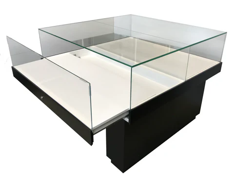
A retail jewelry display stand is a good example of a fixture people underestimate. It doesn’t take up much room, but it’s perfect for filling those in-between areas with something that still feels intentional.
You’re not using it for bulk display. You’re using it to highlight a few key items:
- featured pieces
- add-ons near checkout
- items you want to test without committing full space
Because it’s smaller, customers are more likely to engage without feeling like they’re stepping into a full display zone.
End Caps That Actually Work
A lot of stores either ignore end caps or overload them.
End caps should be simple. One idea, one category, clearly presented. If customers can’t understand what they’re looking at in a couple of seconds, it’s not working.
Smaller fixtures — like stands or compact displays — often work better here than full shelving units. They keep things focused.
Countertop Space Is Usually Wasted
Most checkout counters are either completely empty or completely cluttered. Neither is ideal.
There’s usually room for a small, controlled display. Not a pile of products — just a few items that make sense at that point in the customer journey.
Again, this is where something like a small jewelry stand works well. It gives structure without getting in the way of transactions.
Transitional Zones Need Attention Too
Think about where one section of your store ends and another begins.
Those transition points are often ignored, but they’re where customers naturally slow down. That makes them good spots for lightweight displays — something that bridges categories or introduces a new product type.
You don’t need a full setup here. Just enough to catch attention and guide movement.
Don’t Overfill Just Because There’s Space
The biggest mistake with overlooked areas is trying to fill everything.
Empty space isn’t always bad. It gives the eye a break and helps key displays stand out. The goal isn’t to use every inch — it’s to use the right spaces properly.
Keep It Flexible
Smaller fixtures should be easy to move. If something isn’t working, you should be able to change it quickly without reworking the whole layout.
That’s the advantage of using stands and compact displays. They let you test placements, swap products, and adjust flow without committing to a permanent setup.
What This Comes Down To
Most stores don’t need more big fixtures. They need to make better use of the space between them.
Those smaller, overlooked pieces are what tie the layout together. When used properly, they turn empty or awkward areas into something that actually contributes to sales — without making the store feel crowded.